With the newest release of version 19.0.0, I’d like to go over how Plixer Scrutinizer’s UI has changed to make finding data easier. There are a few new ways to accomplish the same tasks in the newest release that differ from the version 18.20 and under. This blog will cover how to accomplish some common workflows in the new UI, and how to navigate to the data you need even faster than before.
Alarms
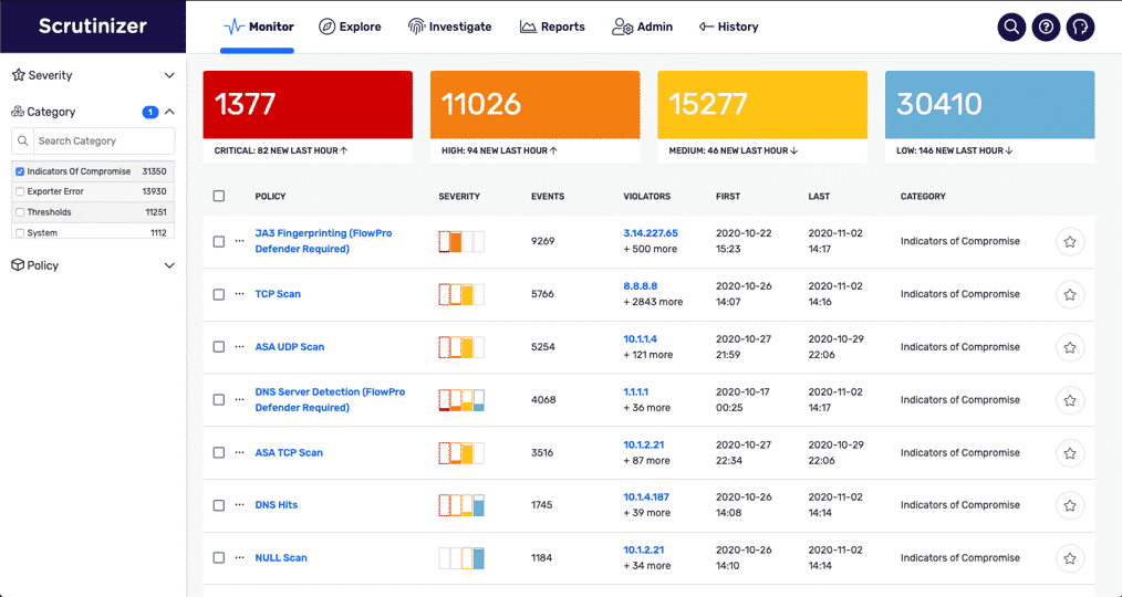
Depending on your user’s settings, you will most likely log in to Plixer Scrutinizer’s UI and land on the Monitor tab. This is the new home for all alarming data. Before version 19.0.0, you would navigate to the Alarms tab to seek out anomalies found by Plixer Scrutinizer’s built-in security algorithms. This information has been moved to the Monitor tab of the UI and was designed to be more aligned with security industry standards. Here you can easily see the difference between system-level alerting, custom report thresholds, and indicators of compromise.
The options on the left side of the Monitor tab will help you distill the alarms displayed to help find the information you are looking for (or even the information you didn’t know you needed). You can filter down by the severity of the alarms, the alarm category, or the exact alarm itself. From there, you can see more details on a specific alarm by selecting the name from the list.
Exploring data
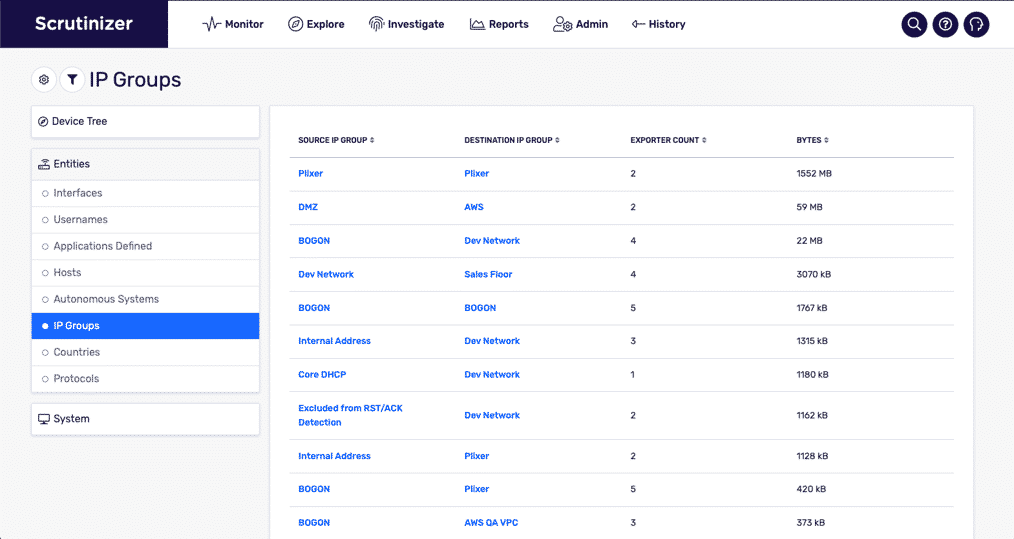
Another big change in Plixer Scrutinizer version 19.0.0 is the addition of the Explore tab. Here is a collection of data formally dispersed throughout the Plixer Scrutinizer interface now available on a single page. On the left of the page is a list of different types of information from current interface utilization, current users accessing network devices, and conversations between countries.
Reporting
Before version 19.0.0, reports were run from the Status tab. The Reporting tab is the new home for this functionality. This may seem like a small change, but a more guided experience helps cut down the time spent looking for information and instead lets you focus on evaluating it. After selecting the Reports tab, you can use the UI to refine the report down to the exports, devices sending flow data to Plixer Scrutinizer, and the type of report you are looking for. The list of available reports is based on the exporter selected, and vice versa if you were to select the report type first.
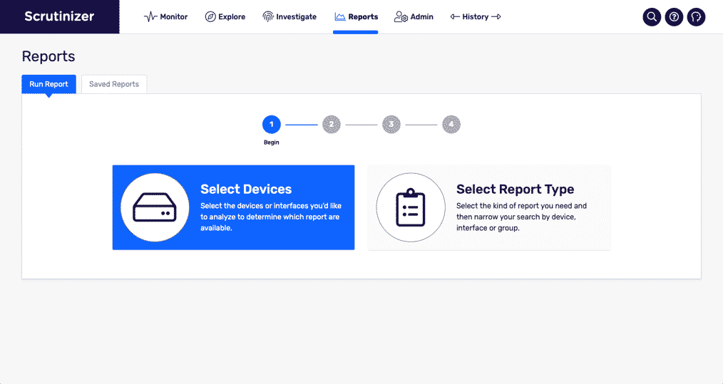
One quality-of-life change we included was the breaking down of the reports menu into easy-to-find categories. Some of the more popular and often used reports now show in the “Recommended” group.
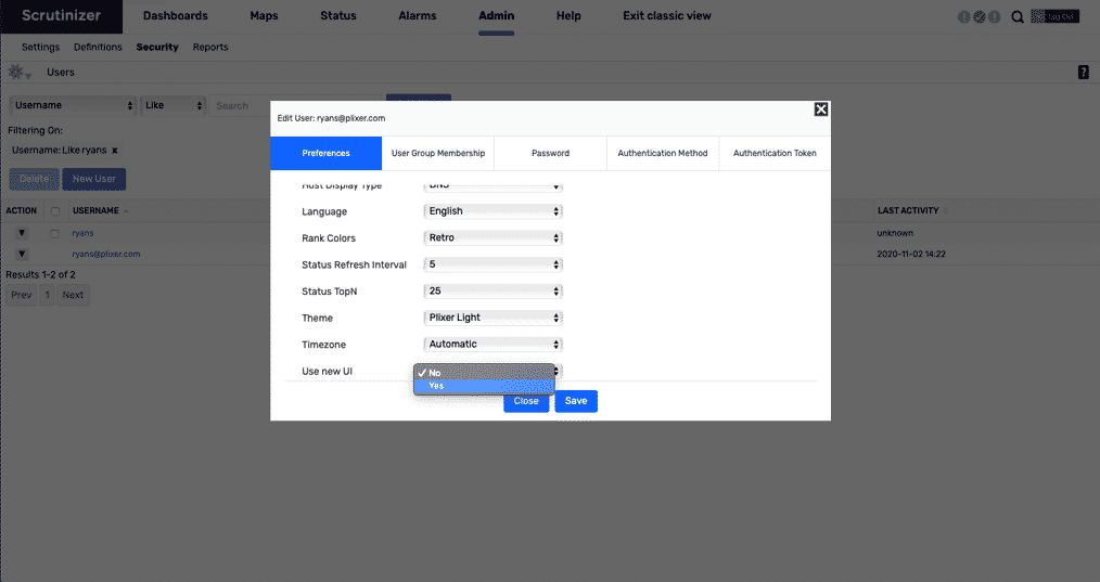
But if you are more comfortable in the older UI, you still have the option to set that as your default interface. Navigate to the Admin tab, which is the only page that does not have a new UI page as of the 19.0.0 release. From here, you can update your users’ default interface option to the old UI.
Keep in mind that the information here is more of a quick map of the new UI. If you have any questions or would like to schedule a bit of time to go more in depth with any of the features in your Plixer Scrutinizer Network deployment, feel free to reach out to Plixer’s support team. Until next time, have a great day!