Dashboards are the fastest way to turn network data into something you can act on.
Instead of scrolling through reports or waiting for alerts, a dashboard lets you see how your network is behaving right now; at a glance you can glean info like which links are busiest, which users are driving traffic, and whether anything looks unusual.
In Plixer One, dashboards aren’t fixed templates. They’re completely customizable spaces you can shape around your role and priorities. You decide which metrics matter, how they’re arranged, and how often they refresh. Adding or rearranging panels takes only a few clicks, so you can start with a simple view and refine it as you go.
Whether you manage performance, plan capacity, or just need quick confirmation that everything is running smoothly, a custom dashboard gives you answers fast.
Our Director of Technical Services, Ryan, walked through everything we’ll discuss here. Check it out if you prefer following along a video:
Plixer One’s Out-of-the-Box Dashboards
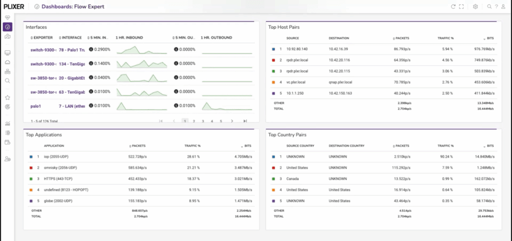
After logging in to Plixer One for the first time, you’ll land on a default Welcome dashboard. It displays quick start tips, configuration status, recent alarms, and exporter counts. There’s also the Flow Expert dashboard, which surfaces top interfaces, hosts, applications, and countries. It’s a quick way to confirm that traffic is flowing and exporters are sending data.
Feel free to experiment with these default dashboards. You can copy, edit, or build from scratch once you see what kind of information each gadget provides.
Create A New Dashboard, Then Add and Edit Gadgets
Open the gear menu in the top-right corner and choose Add New Dashboard. Give it a name, decide whether it should load by default when you sign in, and—if you’re working with teammates—choose whether others can view or edit it.
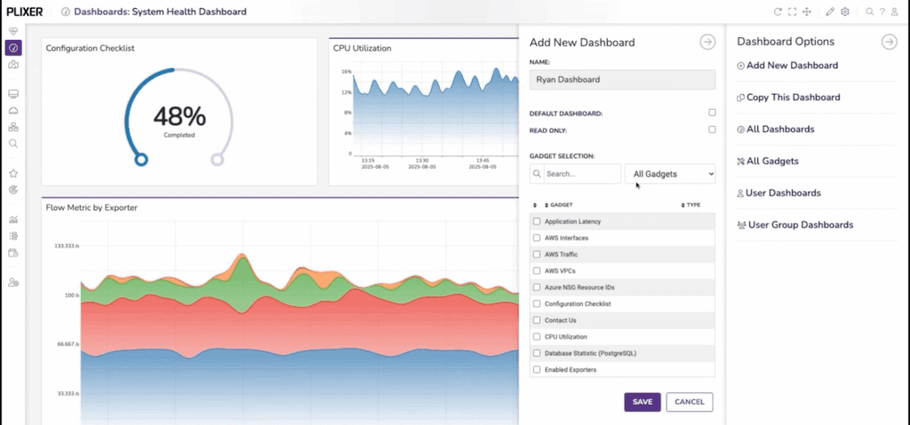
You’ll start with a blank page that’s ready to fill with gadgets, i.e. the dashboard’s individual panels. Each one displays data directly from Plixer One’s reporting engine. Click Add Gadget, browse the list, and select what you want to display; Top Interfaces or Top Applications, for example.
Gadgets appear instantly and begin updating as new flows arrive. By clicking the top-right Edit Gadget Layout button, you can move or resize them at any time, and the layout editor makes it easy to group related views. When you exit edit mode, your layout saves automatically.
Clicking on a gadget lets you go straight to the report that generated the data behind that gadget. From here, you can adjust the report: add filters, change timeframes, and so on.
Turn a Report into a Gadget
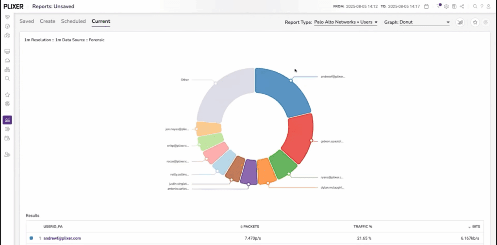
Anything you can report on can become a gadget. For instance, let’s say we want a gadget that shows who’s using the most bandwidth over the last five minutes:
- Open the Reports page.
- Choose your exporter (in our example, we’ll select a Palo Alto firewall)
- Select a report type (we’ll select Users under the Palo Alto Networks report type)
- Set the time range to Last 5 Minutes
- Filter any entries by dragging them to the Exclude or Include fields
- Select an appropriate graph type; in this case, Donut Graph provides a clear share-of-traffic view.
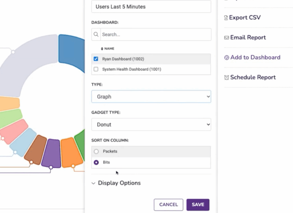
Now you can click the top-right Save Report button, then the Export Report button to add it to a dashboard. Then, from now on, the gadget will update in real time and provide an always-on view of top users without rerunning reports.
Tune Gadgets as Needed
The standard Top Interfaces view lists every interface seen by Plixer One. Let’s say you determine that’s too broad for you needs, and want to narrow the scope. You can do this in a few steps:
- In your dashboard, select Create New Gadget.
- Set the type dropdown to Interfaces
- Give it a name, such as “My Top Interfaces”
- Configure the display options, such as refresh interval and number of entries displayed
- Select only the exporters and interfaces you want to monitor
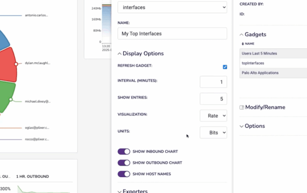
Now you have a compact view that focuses on the uplinks or routers that matter most. This selective approach keeps the dashboard readable and relevant.
Add a Network Map
Charts show quantities; maps show relationships. A network map lets you visualize how exporters connect and how much data moves between them. Here’s how to set up a network map in Plixer One:
- Click the Network Maps in the left sidebar
- Name the group of exporters and choose a map type
- Add your exporters as map objects
- Arrange the exporters to match your topology
- Right-click on an object and select Create Connection and specify the details about the connection
- Repeat step 5 as necessary for additional connections
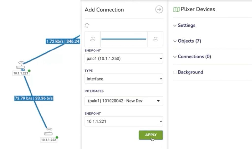
You can also tie each connection to live report data so that color or width changes according to custom thresholds. For example, we might create a new object, displayed as a cloud icon, and link it to our map’s Palo Alto firewall with the “Top Users” report we created for our dashboard to show user activity across that path. Any Plixer One report can be used in network maps this way.
When finished, save the map and add it to your dashboard as another gadget.
Pulling It All Together
After a few minutes, you might have:
- A Top Applications panel for quick visibility
- A Top Users donut chart
- Two Interface Utilization gadgets—one global, one filtered
- A Network Map for context
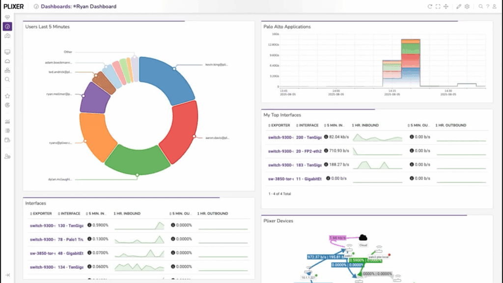
From here, it’s easy to adjust refresh intervals, rename gadgets, or save new versions for different locations or teams.
And each gadget is clickable. If something looks unusual, you can open the full report directly from the dashboard.
Share, Reuse, Iterate
Dashboards can be exported, cloned, or shared read-only with other users. Because every gadget is built on stored reports, others can view the same data without rebuilding it from scratch.
This makes it simple to standardize what “normal” looks like across operations teams and shift hand-offs.
As you add exporters or new flow sources, you can also duplicate existing gadgets, change filters, and keep using the same layout. The data source stays consistent, so your comparisons over time remain accurate.
When paired with Plixer One’s alarms and machine-learning analytics, dashboards become part of a larger cycle: collect, visualize, investigate, and tune.
From Setup to Insight
The first time you open Plixer One, it takes only a few minutes to move from a default view to a custom dashboard that surfaces real, actionable information. There’s no special syntax to learn and no waiting for scheduled reports.
Build once and watch it run.
Plixer One is built to get you from data to answers in minutes. Schedule a demo today to start turning your complex network data into immediate clarity.
Related

From User Complaint to Root Cause: Tracing a Slow App Across WAN and Cloud
Let’s say a user reports that an application feels slow. It’s not completely down, but just sluggish enough to be annoying or get in