Dashboards give NetOps teams fast situational awareness. But when performance degrades or QoS policies fail, you need to drill down further. To understand what really happened, the ability to seamlessly pivot from dashboards to raw flow records is invaluable.
That end-to-end visibility is where Plixer One shines. In this post, we walk through how our platform connects visual dashboards to detailed flow data, letting you move from macro to micro in seconds.
Our data scientist, Adam, has also discussed these features and workflows in the video below.
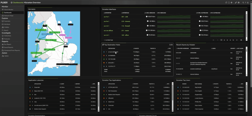
Dashboards as your launch pad
When you first log into Plixer One, you land on a customizable dashboard summarizing key interfaces, sites, or applications. Each tile (called a gadget) is a pivot point into live data.
Every time you find a workflow or filter combination that proves useful, you can save it as a data source. These sources populate future dashboards and reports, building a library of repeatable investigations.
In other words, none of your effort is ever wasted. Any helpful view can be saved and reused, whether as a dashboard gadget or a saved report. And of course, you can adjust filters on that saved view depending on the context of your current investigation.
Viewing by interface for real context
From the dashboard, you can drop directly into an Interface Report. Here, Plixer One lists every exporting device and interface, complete with SNMP‑learned names, not just numeric indexes.
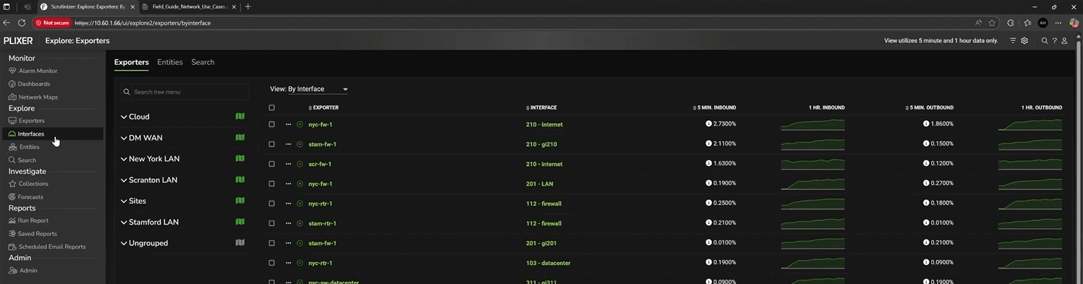
This view answers critical questions like:
- Which interfaces are generating unexpected load?
- Are DSCP or QoS markings preserved from hop to hop?
- Where exactly is traffic transformation occurring?
Plixer One stores one‑minute flow intervals—as granular as flow data can be—so you can pinpoint changes with precision. For example, if an application marks its packets as EF (Expedited Forwarding) but the network reclassifies them downstream, you can visually confirm where that mutation occurred.
Filtering WAN interfaces and launching reports
Once you’ve identified the relevant interfaces—say, all WAN links—Plixer One makes it easy to filter and pivot. Using the top-right Filter icon, you can search for interface names containing “WAN” and create a subset view.
With that selection active, click the top-right Bulk Actions icon > Reports > select a report type to generate flow analytics scoped to those interfaces. At this point, Plixer One will pull in the interfaces you’ve already selected as the input domain; no need to manually specify devices each time.
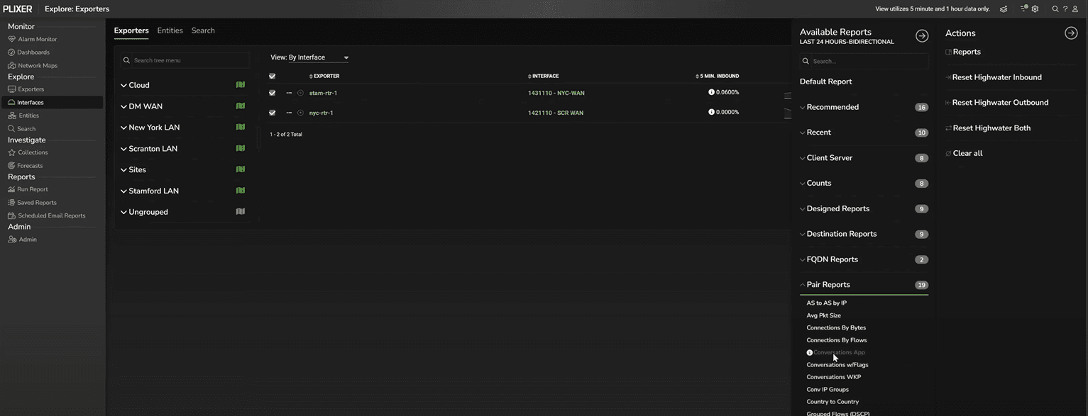
In this example, we’ll select Pair Reports > Conversations by Application, which will reveal which hosts and services dominate the WAN.
Conversations by application: seeing what’s talking to what
The Conversations by Application report presents the familiar NetFlow five‑tuple: source IP, destination IP, source port, destination port, and protocol. Against each flow pair, Plixer One aggregates bytes and packets.
Filtration in Plixer One is sticky; any filters you apply carry forward to subsequent reports. For instance, noticing heavy activity from a host (like “srv‑finance” in this example) you can simply drag it into the Include field and click Apply. This will filter on that host, whether it’s the source or the destination, and every future report you open during this investigation will now respect that filter.
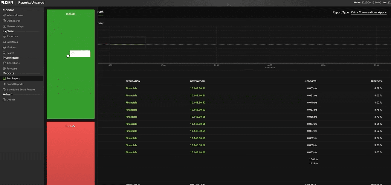
For example, perhaps filtering on that host wasn’t particularly useful in this report. But we can simply select a different report type to get a different view of the network data, still filtering by the srv-finance host.
In this case, we want to see every application the host is communicating with. By switching to a Top > Applications Defined report, we can see that this host is only communicating with the Financials application.
This design eliminates repetitive setup and enables true investigative agility: start broad, narrow progressively, and preserve context at every step.
Application enrichment: from generic ports to business context
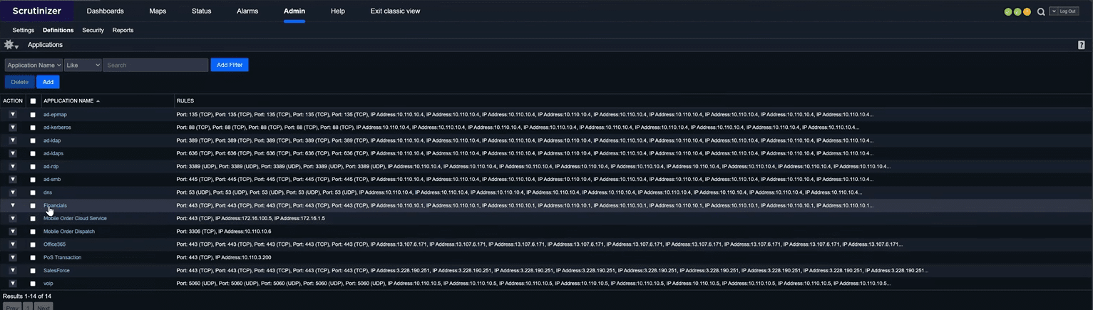
Without enrichment, encrypted traffic can blur together. In this example, if we run a Well Known Ports report (and remember, Plixer One preserves our filters) we’ll only see undifferentiated HTTPS (TCP/443) web traffic. But after enrichment, Plixer One recognizes that the same 443 flows hitting a particular IP range belonged to the Financials application.
Enrichment is defined under Admin → Definitions → Applications, where you can map local IP ranges and ports to meaningful business apps. For NetOps, that means reports read like operations dashboards: Finance ERP, VoIP Gateway, CRM Cloud rather than raw port numbers.
This context makes performance validation possible. You can filter by business application, correlate to interfaces, and confirm whether service degradation is network‑related or upstream.
Reconstructing past incidents with flexible input domains
Not every analysis happens in real time. Often, you need to reproduce conditions from a previous event—for example, a ticket about slow VPN performance last Tuesday.
To start, click Run Report from the sidebar. You’ll have two options: by device or by report type.
Choosing Select Report Type surfaces a categorized list (Firewall Events, Interface Reports, Application Usage, etc.). Plixer One automatically filters out report types for which you have no data, based on the flow templates received. You won’t be presented with an empty or irrelevant option.
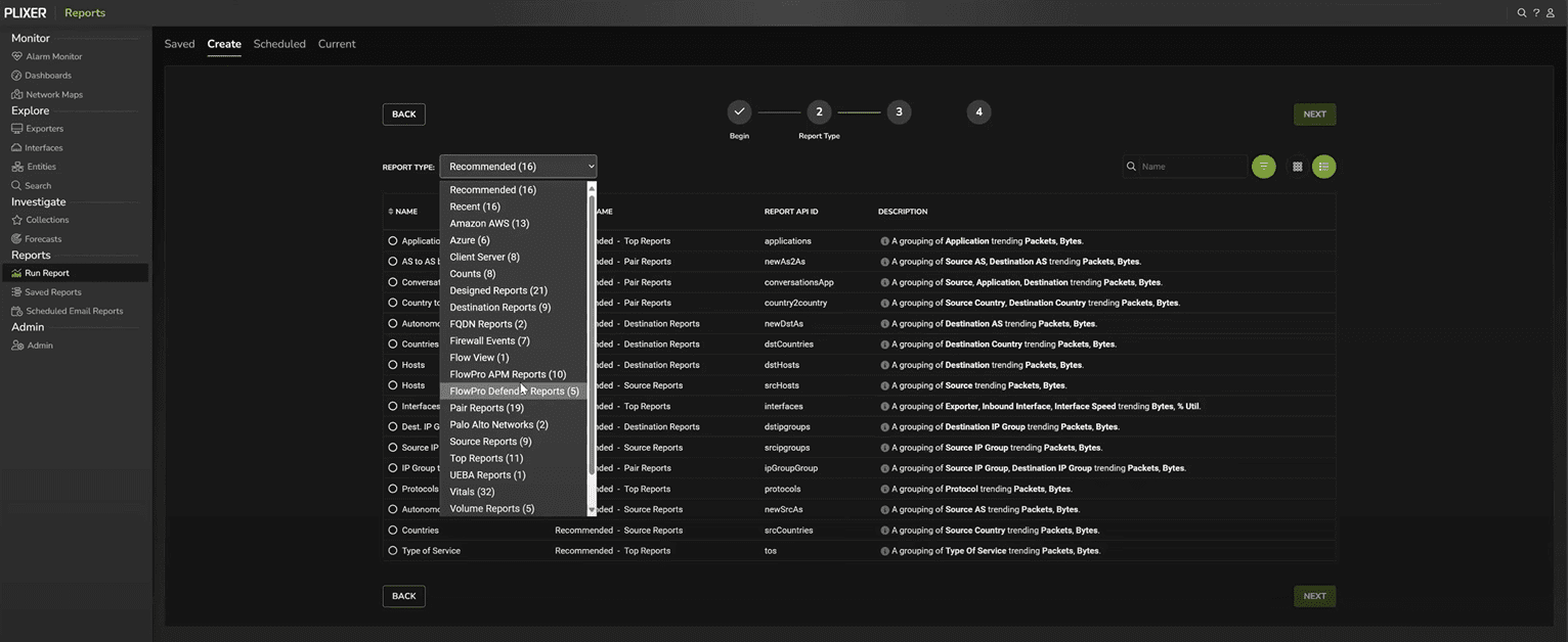
This dynamic adaptation ensures reports remain accurate across vendors. Whether the exporter is Cisco, Palo Alto, or Juniper, Plixer One reads the IPFIX templates and exposes only valid data fields.
Leveraging enriched exports from next‑gen firewalls
In this example, we’ll select a Palo Alto Users report. Palo Alto’s DPI engine classifies applications and usernames, which Plixer One automatically incorporates.
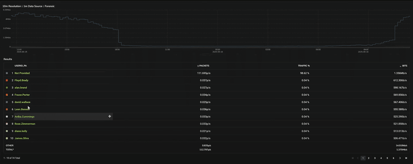
From here, you can click a username and instantly pivot to other data tied to that device, even across sessions.
This linkage from interface to user consolidates visibility across layers. Troubleshooting slow access for one user no longer means correlating logs manually; Plixer One delivers a single pane for validation.
Visualizing business functions and drilling down into granular data
Plixer One’s IP Group Definitions is another powerful feature for NetOps. These definitions map subnets to functional roles.
We’ll run an IP Groups by Application report with our firewalls selected, then change the graph type to Sankey. This makes it easy to understand traffic movement between business functions.
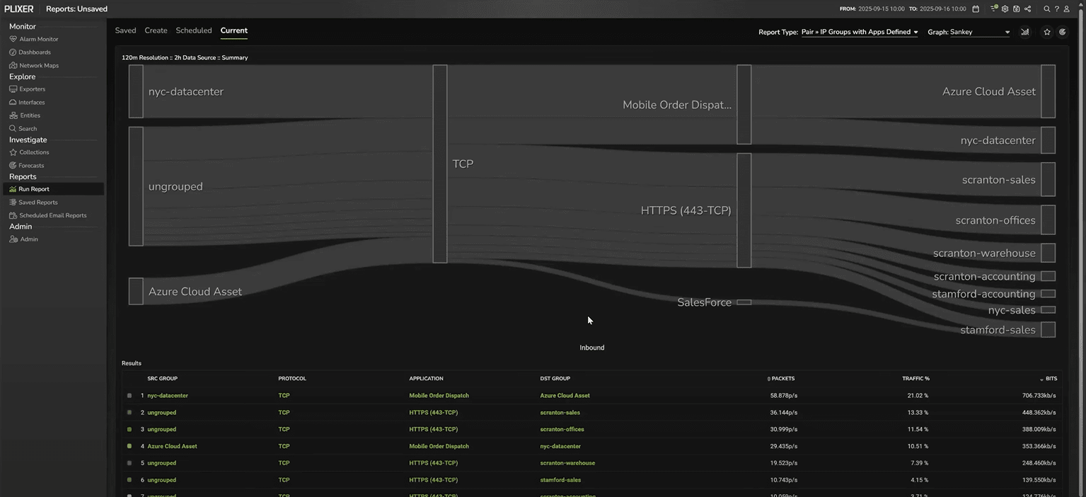
Now we have visibility into what applications are being handled and what business functions those applications are moving between. If a problem is affecting one function, you can filter down and then adjust the view as needed.
In this case, we might filter on the nyc-datacenter firewall and switch back to a line graph for a temporal view. This lets us see any spikes or lulls in the relevant traffic at a glance.
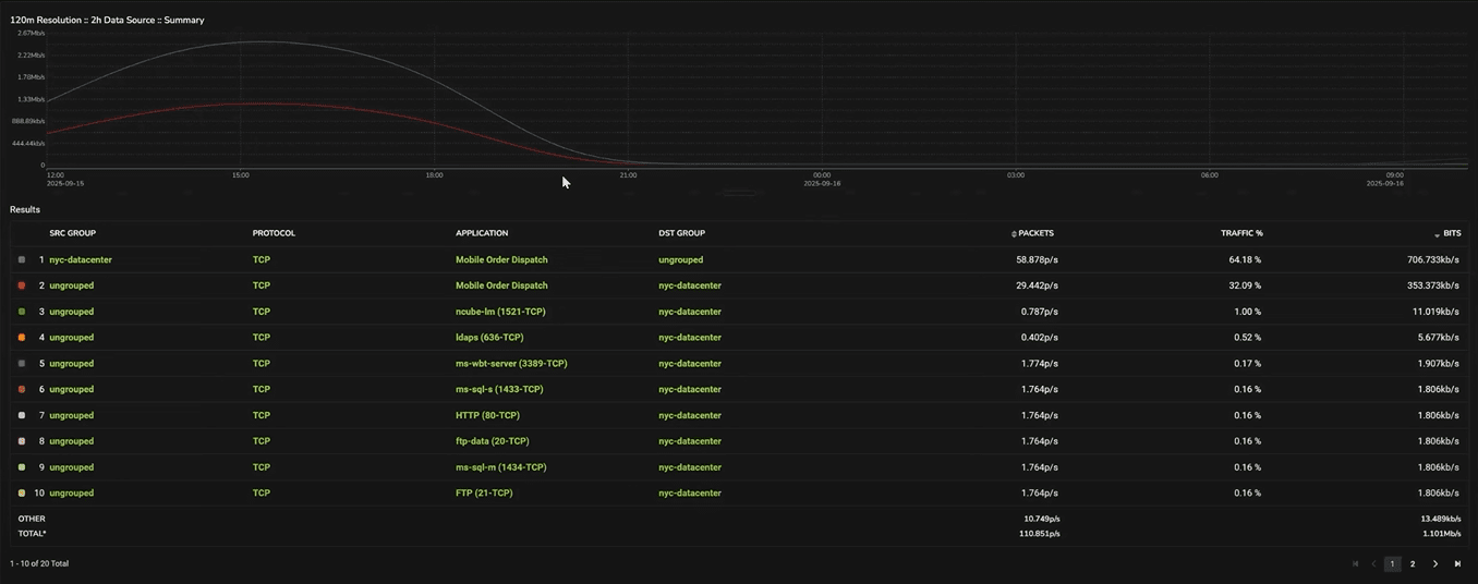
Our graph also starts wide, at two-hour intervals. But we can simply drag and highlight a segment of the graph to zoom in on that timeframe and switch to, say, 30-minute intervals. And we could continue to drill down into more and more granular data.
Each zoom-in reveals more granular flow records, helping pinpoint when a degradation started.
Drilling down to raw flow records
After we drill down, we can pivot to a raw Flow View. This view presents each flow record exactly as exported by the device.
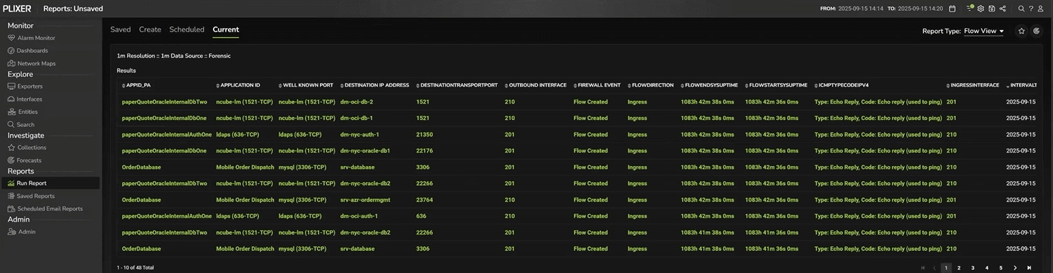
This is the digital equivalent of packet‑level evidence—without the overhead of full packet capture.
For regulatory or audit purposes, these raw records serve as a proof artifact: an immutable, time‑stamped record showing that the network behaved as intended.
Next steps
Plixer turns your dashboards into a starting line where you can quickly pivot into a granular investigation—helping you collect, analyze, respond, and optimize without losing context. Want to see how this would look in your environment? Schedule a personalized demo with one of our engineers today.
Related Posts

Why Most Performance Investigations Start in the Wrong Place
When users report that “the network is slow,” most investigations begin where frustration is loudest. That may be, for instance, an application dashboard showing